I ran into two clients the same week. One’s a financial advisor. The other one does estate planning. Different towns, different businesses, no connection to each other whatsoever.
Same photo on both Facebook pages.
Not a similar photo. The same one. Same guy at the same desk, same warm gray-blue, same soft light coming through the same window, same little stack of papers angled the same way. Their Instagram grids matched too. Different words on top. Everything underneath was identical.
Neither of them did anything wrong. They both asked an AI to make something professional, and the AI did exactly what it was told.
“Professional” is not a style
Here’s the thing nobody mentions. When you type make it look professional, the machine doesn’t hear a design direction. It hears an average. It goes and finds the dead center of every business image ever made and hands you the middle of it.
The middle is safe. The middle is also where everybody else is standing.
So two of my clients got handed the same middle, in the same week, by the same machine. And they had no way of knowing, because neither one of them follows the other.
A style is a decision
A real style is a set of rules about type, space, color, and edge that somebody chose on purpose because it fits the business wearing it.
An estate planning attorney and a retro arcade bar should not look alike. That sounds obvious written down. It stops being obvious the second you’re staring at a blank page and the fastest tool in the room will happily fill it with something adequate.
Nine styles, nine completely different answers
Every image below was generated with AI. All nine. I want to be upfront about that, because it’s the whole point. The machine can absolutely produce any of this on demand. What it cannot do is know which one belongs to your business.
Minimalism
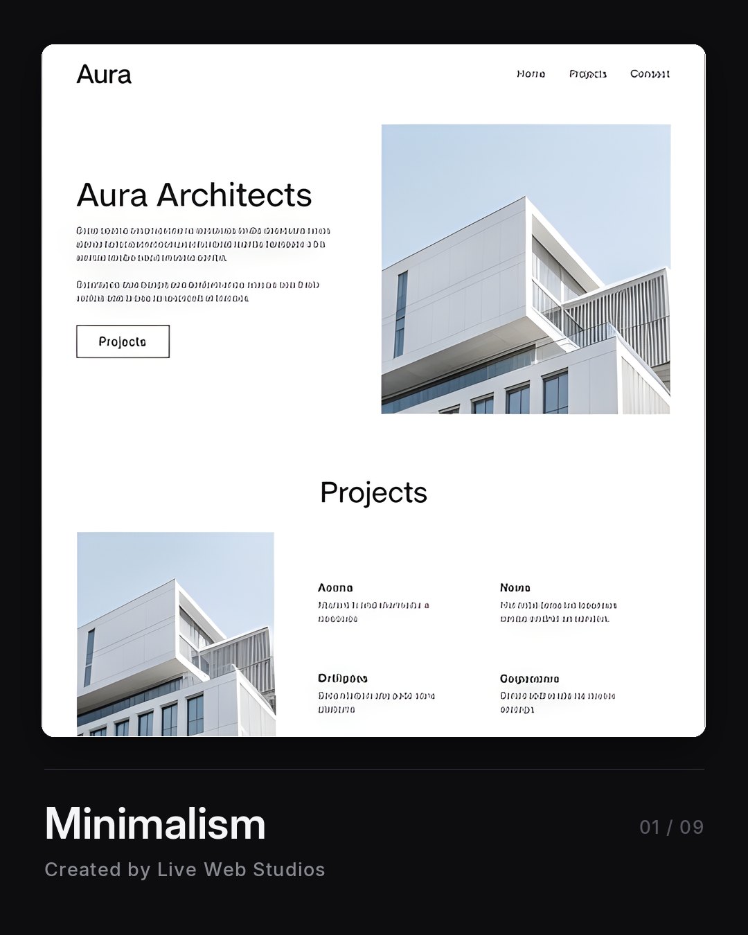
Space does the work. Strip out everything that isn’t load-bearing and whatever survives has to be good, because there’s nothing left to hide behind. Architects and photographers. Anybody whose portfolio is the pitch.
Brutalism & Neobrutalism
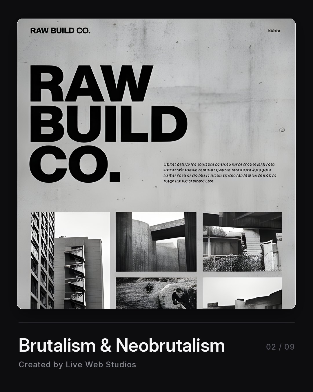
Raw, loud, unpolished on purpose. Heavy type, hard edges, zero decoration. It’s a confidence play. Great for a construction company or a creative studio that wants to look like it doesn’t care what you think. Terrible for a wealth manager.
Constructivism
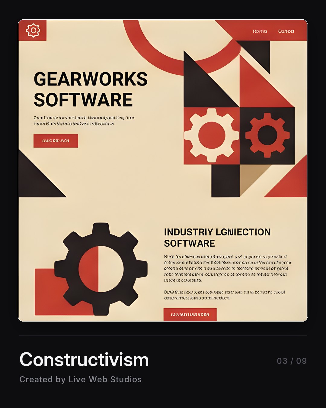
Bold geometry, diagonals, a tight palette usually anchored in red and black. Borrowed straight from 1920s Soviet poster design. It reads industrial and deliberate. Manufacturing, engineering, anything with machinery in it.
Swiss Style
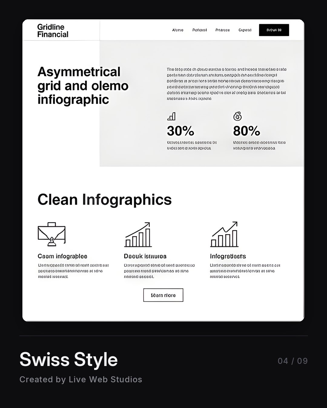
Grid, grid, grid. Asymmetric layout, ruthless alignment, type doing the heavy lifting. This is what “clean” actually means when a designer says it out loud. Financial services and data-heavy sites live here comfortably.
Editorial Style
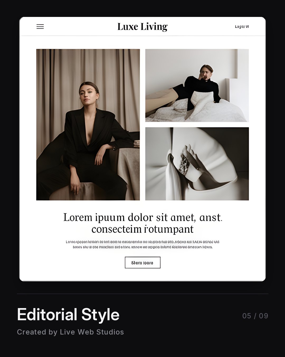
Magazine layout. Serif headlines, generous margins, photography treated like it cost something. Feels expensive without shouting about it. Interiors, fashion, hospitality, anybody selling taste.
Hand-Drawn Style
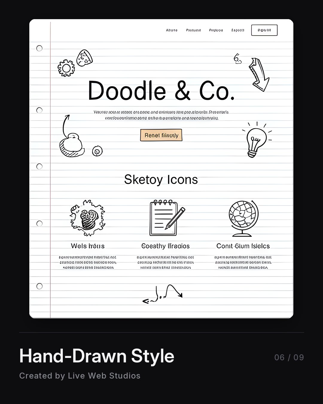
Sketched icons, notebook paper, wobbly lines no computer would draw on its own. Disarming. It works for education, kids’ services, and any business fighting a “these people are stiff” perception.
Retro
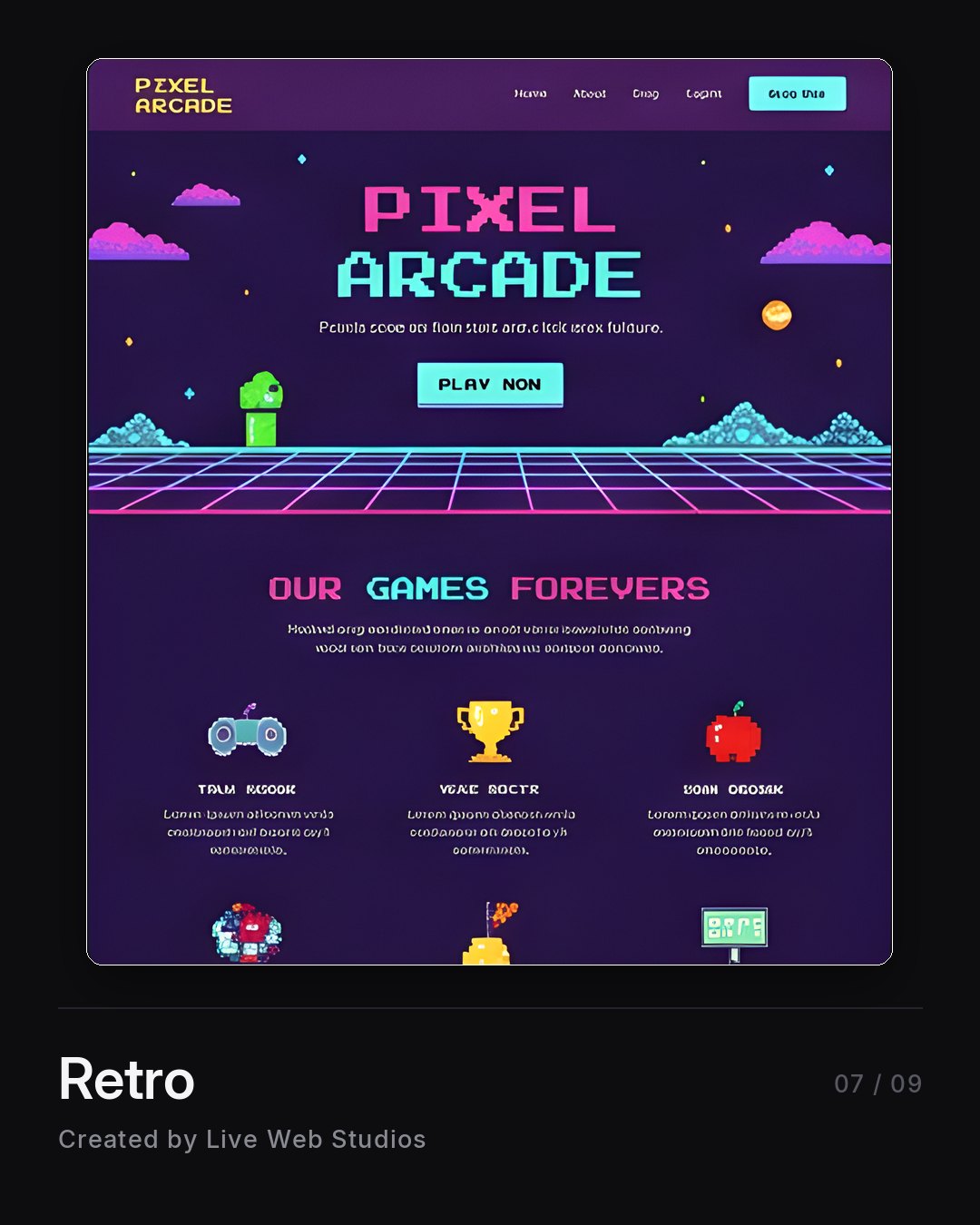
Pixel type, neon grids, deliberate nostalgia for one specific decade. It has to be fully committed or it just looks like a mistake. Arcades, breweries, bands, event promoters.
Flat
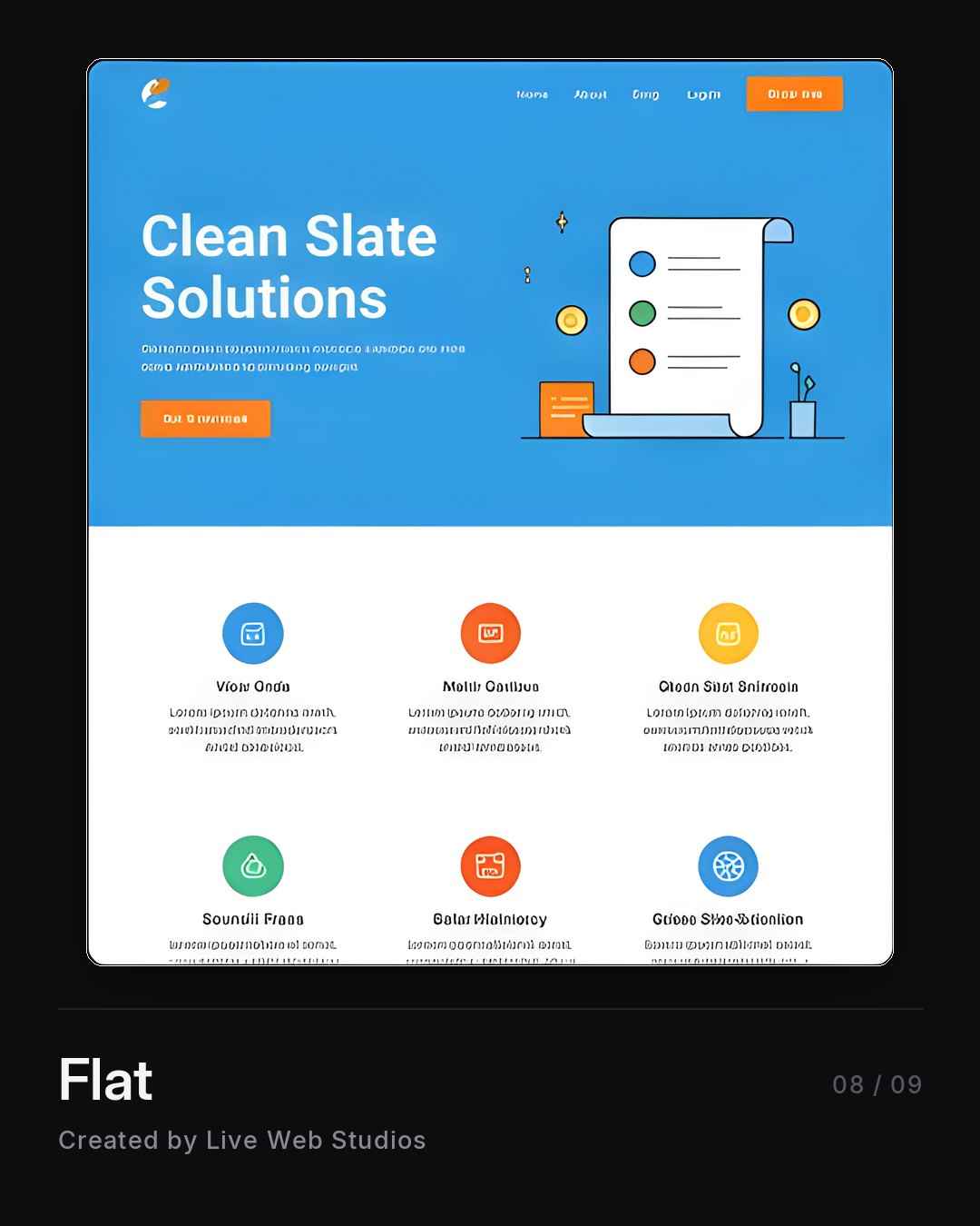
Simple shapes, bright fills, friendly illustration, no fake shadows anywhere. The workhorse of software and service businesses. Approachable, easy to read, and it will never get you accused of being pretentious.
Bento Style
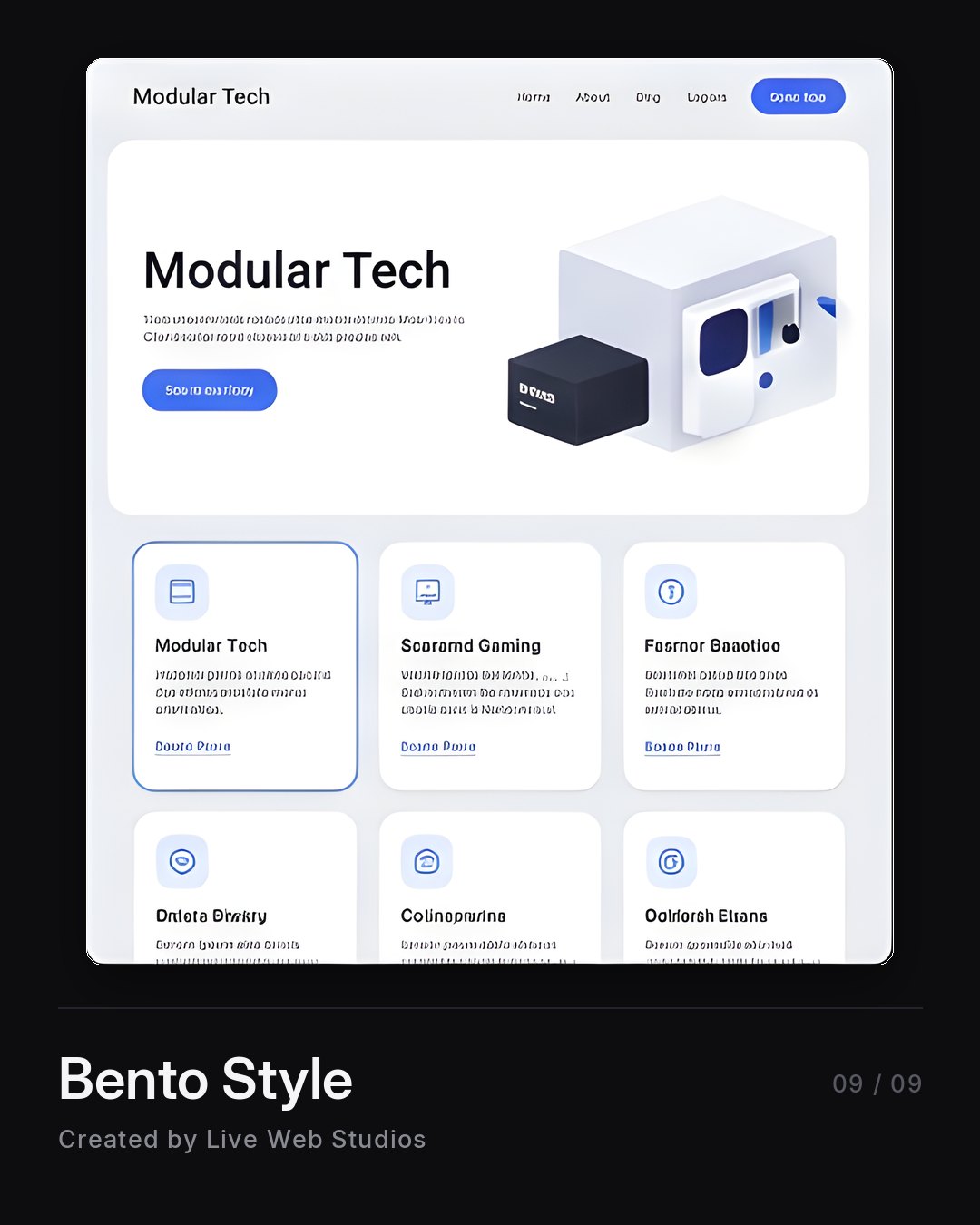
Content in a grid of rounded cards, each one holding a single idea. Named after the lunch box. It’s how you show eight features without building eight pages. Tech products, dashboards, anything with a real feature list.
The part the machine can’t do
Every one of those came out of a generator in about four minutes. I’m not going to pretend otherwise.
But somebody had to know that “Constructivism” was a word. Somebody had to look at a logistics company and think that one. Somebody had to look at nine options and throw out seven.
That’s the job now. It was always the job, honestly. The tools just got a lot faster at the part that was never the hard part.
An AI will give you an answer to any question you ask it. It will not tell you that you asked the wrong question. Ask for professional and you’ll get professional. You’ll also get whatever your competitor got when he asked the same thing on the same Tuesday.
Pick a lane on purpose
Before anybody generates anything, decide what your business is supposed to feel like to a stranger who has never heard of you. Then name the style. Then build it.
If you don’t know which one fits, that’s a completely normal thing not to know. It’s the part I do.
Call me. I’ll tell you which two are wrong for you before we even get to which one is right.