
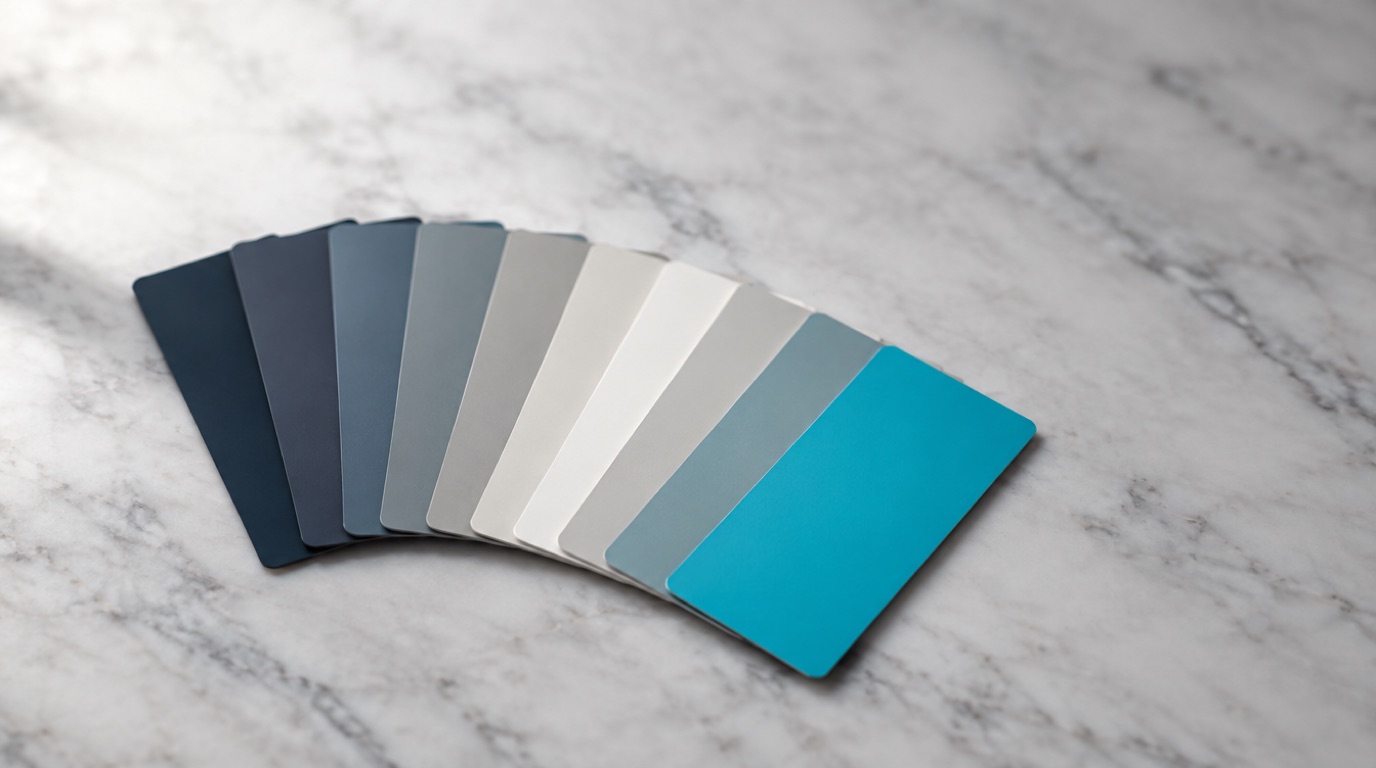
Most people freeze when it’s time to pick colors for their site. There are millions of them. Where do you even start?
Here’s the thing. You already do this every day. You picked what you’re wearing. You picked the paint in your living room. You have taste… you just don’t trust it yet when there’s a website involved.
Color Does the Talking Before You Do
People react to color before they read a word. That reaction is fast and it’s emotional, and you can use it.
Red reads as energy. Passion. Sometimes danger. Blue reads as calm, steady, trustworthy. There’s a reason every bank on earth uses it. Green reads as growth and fresh. Yellow reads as happy and playful. Brown reads as earthy and solid. Black reads as serious. Powerful. A little mysterious.
A kids’ tutoring site wants bright and saturated. A law firm does not. That’s really the whole lesson.
Three Schemes That Always Work
You don’t need a color theory degree. You need one of these three.
Monochromatic. One color, then lighter and darker versions of it. Easy to balance, easy on the eyes, very hard to screw up. Add black, white or grey and you’re done.
Analogous. Colors that sit next to each other on the wheel. One dominates, the others support. Same calm feel as monochromatic with more life in it.
Complementary. Colors from opposite sides of the wheel. High contrast. Use one as your main color and the other as an accent only. That accent is what makes a button impossible to miss.
The Mistake I See Most
People use their accent color everywhere. Then nothing stands out, because when everything is loud, nothing is.
Pick one color for the thing you want clicked. Then be disciplined about it.
Not sure what fits your business? Call me. This is a ten minute conversation, not a project.